Build a Responsive Landing Page with HTML and CSS
August 12, 2026
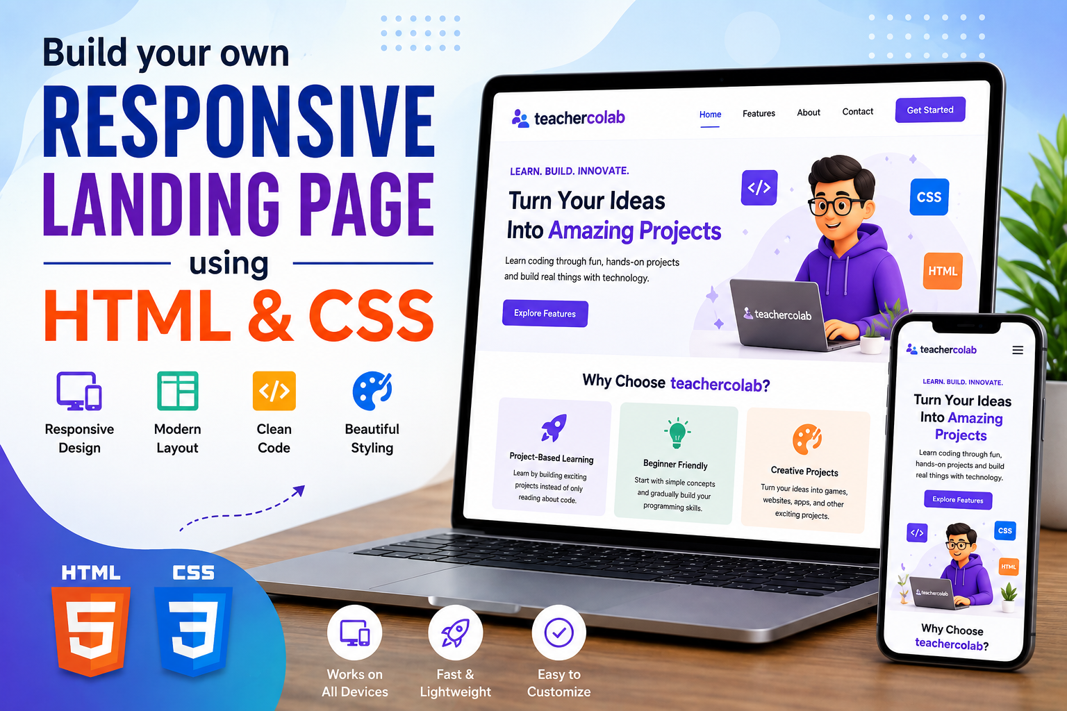
Learn how to build a responsive landing page using HTML and CSS in this beginner-friendly web development project. You'll create a professional-looking webpage with a navigation bar, hero section, feature cards, call-to-action buttons, and a responsive layout that works across phones, tablets, and computers.
What You'll Learn
By completing this responsive landing page project, you'll learn how to structure a modern webpage using HTML and style it with CSS. You'll also practice creating layouts, buttons, cards, navigation menus, and responsive designs.
- Create a webpage structure using HTML.
- Build a navigation bar.
- Create a hero section.
- Add headings, paragraphs, buttons, and links.
- Create feature cards using HTML.
- Use CSS to style a webpage.
- Use Flexbox to arrange content.
- Add hover effects to buttons and cards.
- Create a responsive layout using media queries.
- Test a website on different screen sizes.
What Is a Landing Page?
A landing page is a webpage designed to introduce a product, service, idea, event, course, or project. It usually focuses on one main goal and guides visitors toward an action such as learning more, signing up, or clicking a button.
Landing pages often contain a navigation area, a hero section, important features or benefits, and a clear call-to-action. These sections help visitors quickly understand what the page is about.
What We're Building
Our landing page will introduce a fictional learning platform called CodeSpark. The page will have a clean navigation bar, an engaging hero section, feature cards, and a call-to-action section.
- Navigation Bar
- Hero Section
- Features Section
- Feature Cards
- Call-to-Action Button
- Responsive Mobile Layout
landing-page-structure.txt
Before You Start
Before we start coding, make sure you have everything needed for the project. You don't need any complicated software. A computer, a browser, and a code editor are enough.
- A computer or laptop
- A modern web browser
- A code editor such as VS Code
- Basic knowledge of HTML
- Basic knowledge of CSS
Create a new folder called responsive-landing-page. Inside the folder, create two files: index.html and style.css.
project-files.txt
The index.html file will contain the structure of the landing page. The style.css file will control the colors, fonts, spacing, layout, buttons, cards, and responsive behavior.
Step 1: Create the HTML Structure
Let's start by creating the basic HTML document. HTML provides the structure of our landing page, while CSS will later control how the page looks.
index.html
The DOCTYPE tells the browser that we're using HTML5. The head contains important information about the webpage, while the body will contain the content visitors see.
The viewport setting is especially important for responsive websites because it helps the page display correctly on mobile devices.
Step 2: Create the Navigation Bar
A navigation bar helps visitors move between different sections of a webpage. We'll create a simple navigation menu for our CodeSpark landing page.
index.html
The nav element represents the navigation area. We use a div for the website logo and an unordered list to organize the navigation links.
Each link points to a section using an ID such as #home or #features. Later, we'll create sections with these matching IDs.
Step 3: Create the Hero Section
The hero section is usually the first major section visitors see. It should quickly explain what your website, product, service, or project is about.
index.html
The hero contains a short introduction, a large heading, supporting text, and a call-to-action button. Together, these elements tell visitors what the page is about and encourage them to continue exploring.
You can replace the example CodeSpark content with your own idea. For example, you could create a landing page for a coding course, a school club, a mobile app, a game, or a fictional technology company.
Step 4: Add Feature Cards
Feature cards are a useful way to highlight the main benefits or features of a product, service, course, or website. We'll create three cards for our CodeSpark landing page.
index.html
Each feature is placed inside its own div with the class feature-card. This allows us to apply the same CSS styling to every card.
The emoji icons are simple visual elements that make the cards easier to recognize. You can replace them with images, icons, or other designs later.
Step 5: Create a Call-to-Action Section
A call-to-action, often called a CTA, encourages visitors to take a specific action. Examples include signing up, learning more, starting a project, or contacting a business.
index.html
The CTA contains a heading, supporting message, and button. A clear CTA helps visitors understand what they can do next.
You can change the button text and destination depending on the purpose of your own landing page. For example, you could use buttons such as Join Now, Learn More, Start Learning, or Contact Us.
Step 6: Add CSS Styling
Our HTML structure is ready. Now let's use CSS to transform the plain webpage into a clean and modern landing page. We'll start by resetting the browser's default spacing and creating the basic styles for the page.
style.css
The universal selector * removes the browser's default margin and padding. The box-sizing: border-box rule makes it easier to control the size of elements.
We also enable smooth scrolling so visitors get a smoother experience when clicking links that move them to different sections of the page.
Step 7: Style the Hero Section
The hero section is one of the most important parts of a landing page. We'll use Flexbox to center the content and create a large, visually appealing introduction.
style.css
The display: flex property allows us to easily center the hero content. justify-content centers it horizontally, while align-items centers it vertically.
The linear-gradient() function creates a smooth transition between two background colors, giving the hero section a modern appearance.
Step 8: Style the Feature Cards
Now let's style the feature cards. We'll use Flexbox to place the cards next to each other and make them wrap automatically when the screen becomes smaller.
style.css
The features-container uses Flexbox to arrange the cards. The gap property creates space between them, while flex-wrap: wrap allows the cards to move onto another line when there isn't enough horizontal space.
Each feature card has padding, rounded corners, a white background, and a subtle shadow. These styles help separate the cards from the page background.
Step 9: Create a Responsive Layout
A responsive website automatically adapts to different screen sizes. Our landing page should look good on a large desktop screen as well as on a smartphone.
CSS media queries allow us to apply different styles when the screen reaches a specific width.
style.css
When the screen width is 700 pixels or smaller, the navigation changes to a vertical layout, the hero heading becomes smaller, and the feature cards become easier to display on a phone.
This is an important part of responsive web design. Instead of creating a separate website for phones, we use CSS to adapt the same webpage to different screen sizes.
Step 10: Add Hover Effects
Hover effects make a webpage feel more interactive. We can use the CSS :hover pseudo-class to change the appearance of buttons and feature cards when the visitor moves the mouse over them.
style.css
The transform: translateY() property moves an element vertically. When visitors hover over a feature card, it moves slightly upward and the shadow becomes stronger.
The transition property makes these changes happen smoothly instead of instantly.
Complete HTML Code
You've now created all the main sections of the landing page. Let's combine them into one complete HTML file. Copy this code into your index.html file.
index.html
Challenge Yourself
Finished building the landing page? Great job! Now try customizing the project and adding your own ideas.
- 🎨 Create your own color theme.
- 🖼️ Add an image to the hero section.
- 🧩 Add more feature cards.
- 🔘 Create additional call-to-action buttons.
- 🌙 Add a dark mode design.
- 📱 Create a mobile navigation menu.
- ✨ Add more CSS animations.
- 📊 Add a pricing section.
- ⭐ Add customer or student testimonials.
- 📩 Add a contact form.
What Did You Build?
You've now built a complete responsive landing page using HTML and CSS. This project brought together several important web development concepts.
- HTML → Creates the structure of the webpage.
- CSS → Controls the appearance and design.
- Flexbox → Helps arrange elements in flexible layouts.
- Media Queries → Make the website responsive.
- CSS Hover Effects → Add simple interactions.
- Navigation Links → Help visitors move around the page.
- Feature Cards → Present information in an organized way.
- Call-to-Action → Encourages visitors to take an action.
These skills are useful far beyond this project. The same concepts can be used to build websites for businesses, schools, apps, games, online courses, products, and personal projects.
Take Your Website Further
Your landing page is a great starting point, but you can continue improving it as you learn more web development.
⚡ Add JavaScript
JavaScript can make your landing page interactive. You could add a mobile menu, image slider, dark mode switch, animated counters, interactive buttons, or form validation.
- 📱 Mobile navigation menu
- 🌙 Dark mode switch
- 🖼️ Image slider
- ✨ Interactive animations
- 📩 Contact form validation
🐍 Add a Python Backend
As you learn Python and backend development, you can connect your webpage to a backend and create more powerful applications that can process information and respond to users.
🗄️ Add a Database
A database can allow your website to store information such as user messages, registrations, products, or other dynamic content.
🤖 Add AI Features
Once you start learning about artificial intelligence, you could add an AI-powered assistant, recommendation feature, or another intelligent tool to your website.
Conclusion
Congratulations! You've built your own responsive landing page using HTML and CSS. You learned how to create a navigation bar, hero section, feature cards, buttons, call-to-action section, hover effects, and responsive layouts.
More importantly, you've practiced the process of turning an idea into a working webpage. The skills you've learned in this project can become the foundation for much larger websites and web applications.
🚀 Future Coders Program for Kids
Ready to Start Your Child's Future-Ready Tech Journey?
Empower your child with Coding, Artificial Intelligence, Web Development, Mobile Apps, Robotics, and Future-Ready Digital Skills through live interactive, project-based classes at TeacherColab.